
Keeping Up with the Latest Web Design Trends
Web design trends are constantly evolving to reflect changes in technology, user behavior, and the preferences of website visitors. Here are a few of the latest design trends that are shaping the way websites are created and used.
Dark mode
This feature offers users the option to switch to a dark color scheme. This trend is driven by the rise of OLED screens, which are more energy-efficient when displaying dark colors. Dark mode is also preferred by some users for its visual appeal and reduced eye strain.
Minimalism
This is a design trend that focuses on simplicity and clean lines. These websites typically use a lot of white space, minimal text, and a limited color palette. This approach can make a website feel more spacious, which can help to reduce cognitive overload and improve the user experience.
Custom illustrations and animations
These can add personality and visual interest to websites. Illustrations can be used to convey complex ideas in a simple and visually appealing way, while animations can be used to create engaging interactions and add interest to static pages.
Bold typography
This design trend focuses on the use of large, attention-grabbing fonts to create a strong visual impact. This trend is particularly popular in the world of branding and advertising, where bold typography can be used to make a statement and create a memorable brand identity.
Asymmetry
This involves breaking away from the traditional grid layout to create more dynamic and visually interesting designs. This approach can help to create a sense of movement and energy on a website, while also making it more memorable and distinctive.
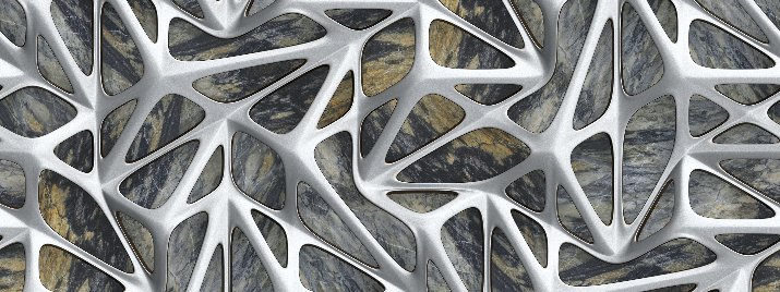
3D design and immersive experiences
These techniques are increasingly being used to create more engaging and interactive websites. This approach can be particularly effective for websites that are focused on entertainment or visual storytelling, as it allows visitors to explore a virtual environment and interact with objects in a more natural and intuitive way.
Neomorphism
This relatively new design trend involves creating interfaces that mimic the physical appearance of objects in the real world. This approach is characterized by a soft, slightly embossed look that is designed to create a sense of depth and tactility.
Gradients and color transitions
These involve the use of two or more colors to create a smooth transition from one color to another. This approach can be used to create a sense of depth and dimension, as well as to add visual interest and create a memorable brand identity.
Voice User Interface (VUI)
This involves designing interfaces that can be controlled using voice commands, rather than using traditional input methods like a mouse or keyboard. This approach can be especially effective for websites that are focused on productivity or hands-free operation.
Mobile-first design
This trend that involves designing websites with a focus on mobile devices, rather than desktop computers. This approach recognizes that more and more users are accessing the Internet on mobile devices, and that websites need to be designed with these users in mind. Mobile-first design typically involves creating responsive layouts that can adapt to different screen sizes, as well as optimizing the performance of a website on mobile networks.
Keeping up with these and other design trends can help you choose a developer who is capable of creating more engaging, user-friendly, and visually appealing websites that meet the needs and expectations of your visitors.
---------------
Nathan Muller is the author of 29 technical books and over 3,000 articles that have appeared in 75 publications worldwide. He also writes articles, blogs and social media content for tech companies and their executives.

Everything You Need. More Than You Expect.
703-407-4363 | info@xpheria.us